The challenge
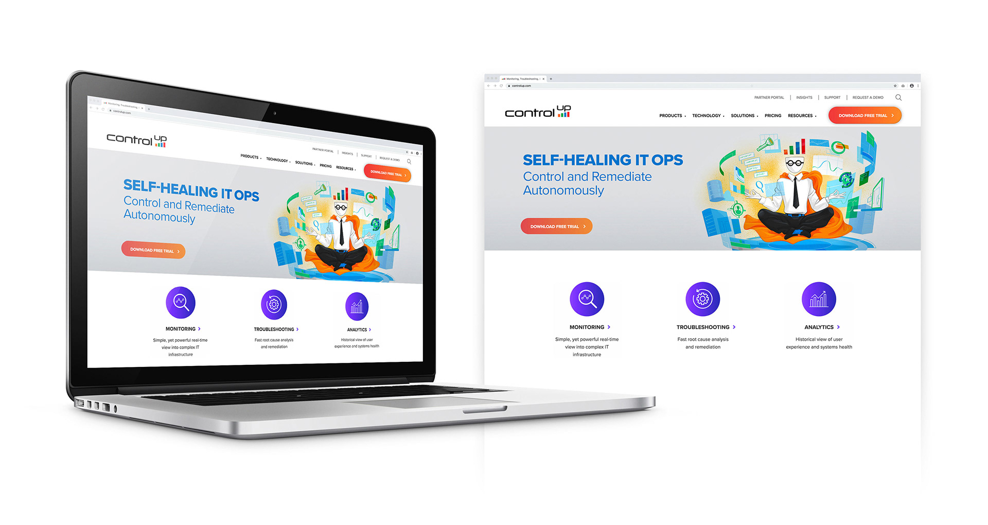
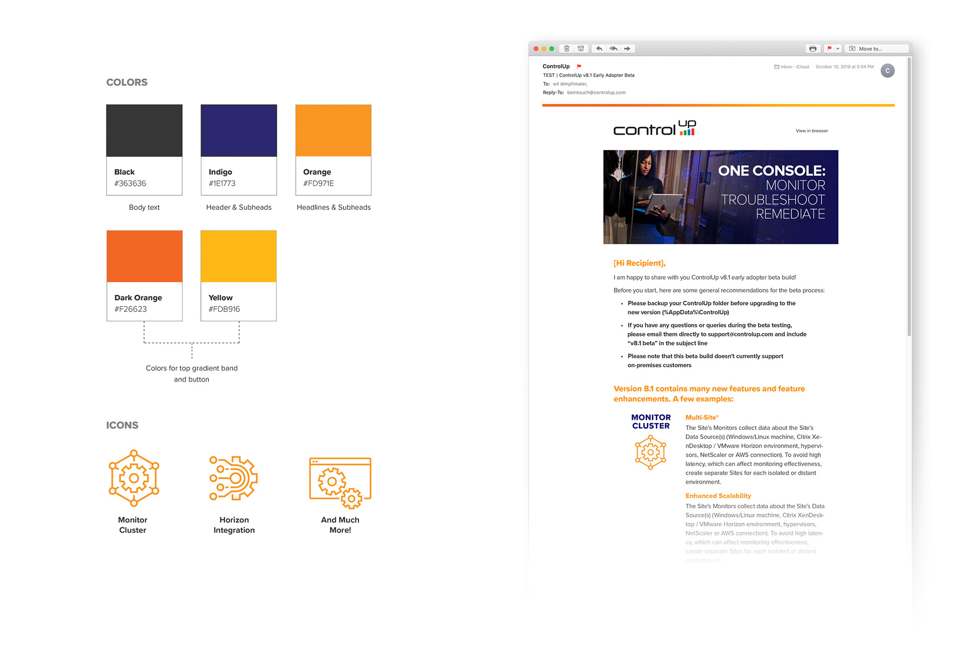
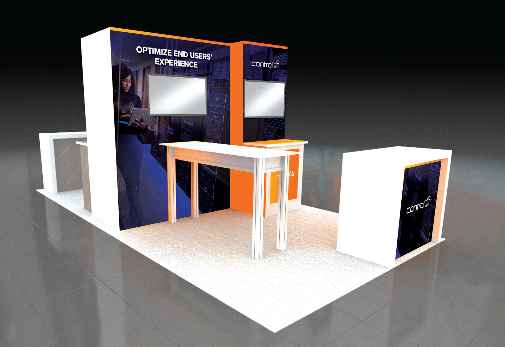
When I came on to help ControlUp I was asked to improve their marketing materials—and challenged to do it by using their current branding. Brand guidelines did not exist but there was a website that served as a base to pull colors and text styles from. Clean iconography and strong colors paired with imagery of end-users became the consistent art direction used. This was applied to various print and digital materials as well as various trade show and event environments.
A legacy character re-imagined
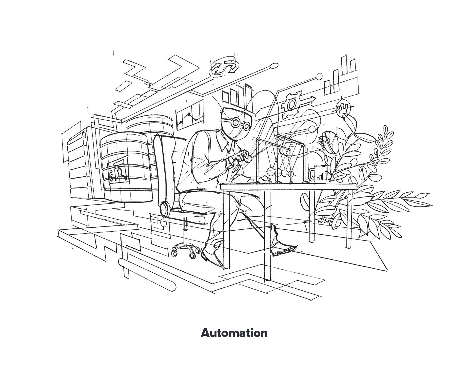
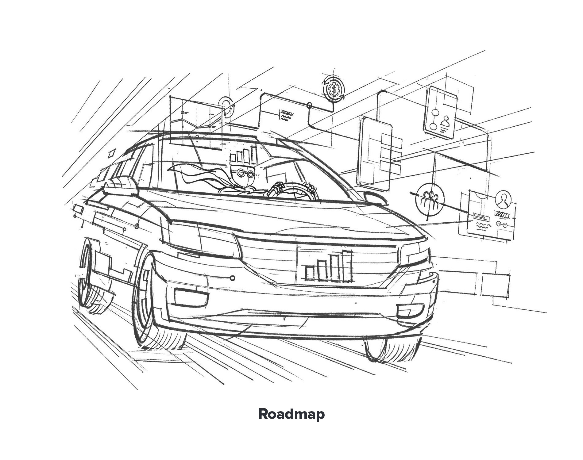
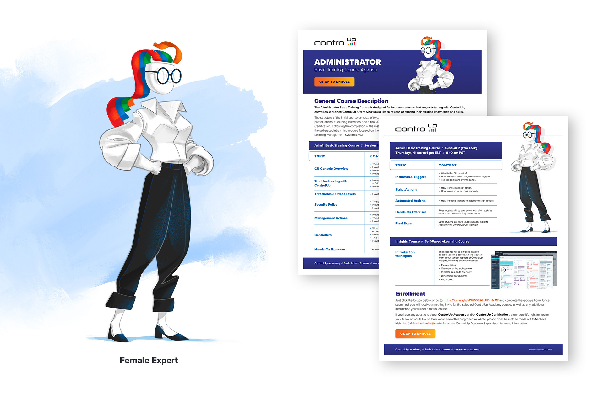
The biggest challenge in working with the existing brand was how to use a legacy character, the Expert, that ControlUp wanted to keep as part of their marketing materials. To help re-imagine the Expert, I enlisted the help of Mirko Grisendi, the extremely talented illustrator from Italy. Mirko's style was the perfect fit to bring this character up-to-date and to a quality that matched the materials being created. A series of illustrations, focusing on the features of the ControlUp product, was collaborated on and then used for many internal and external communications. To further expand the potential of the Expert and create more inclusive elements a female Expert was created and became the featured visual in many projects.