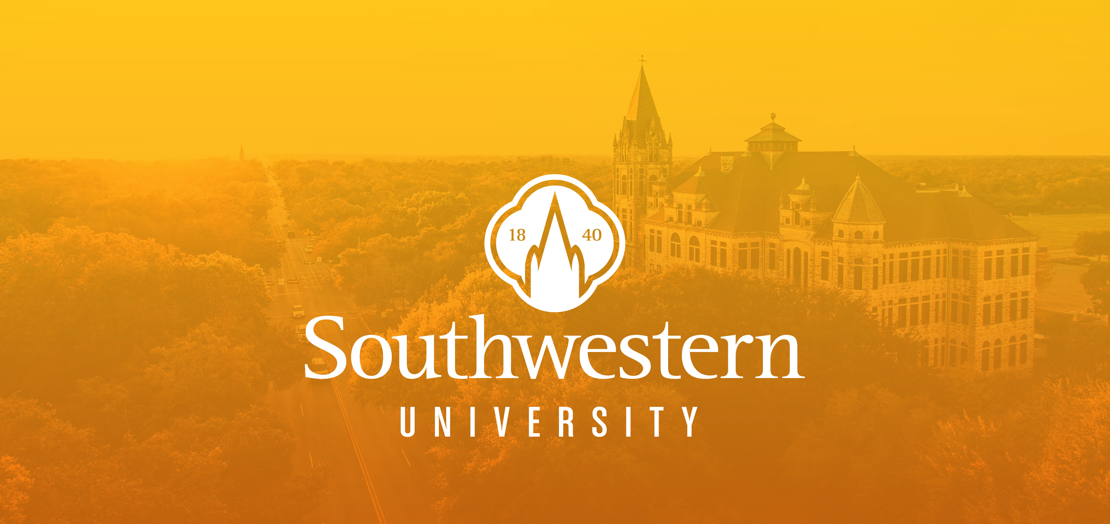

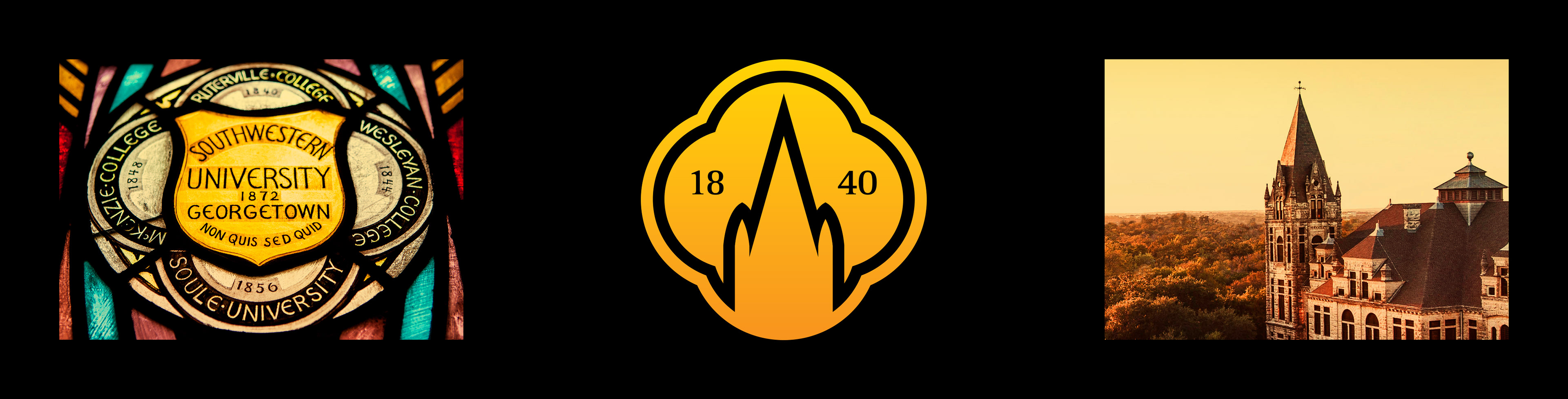

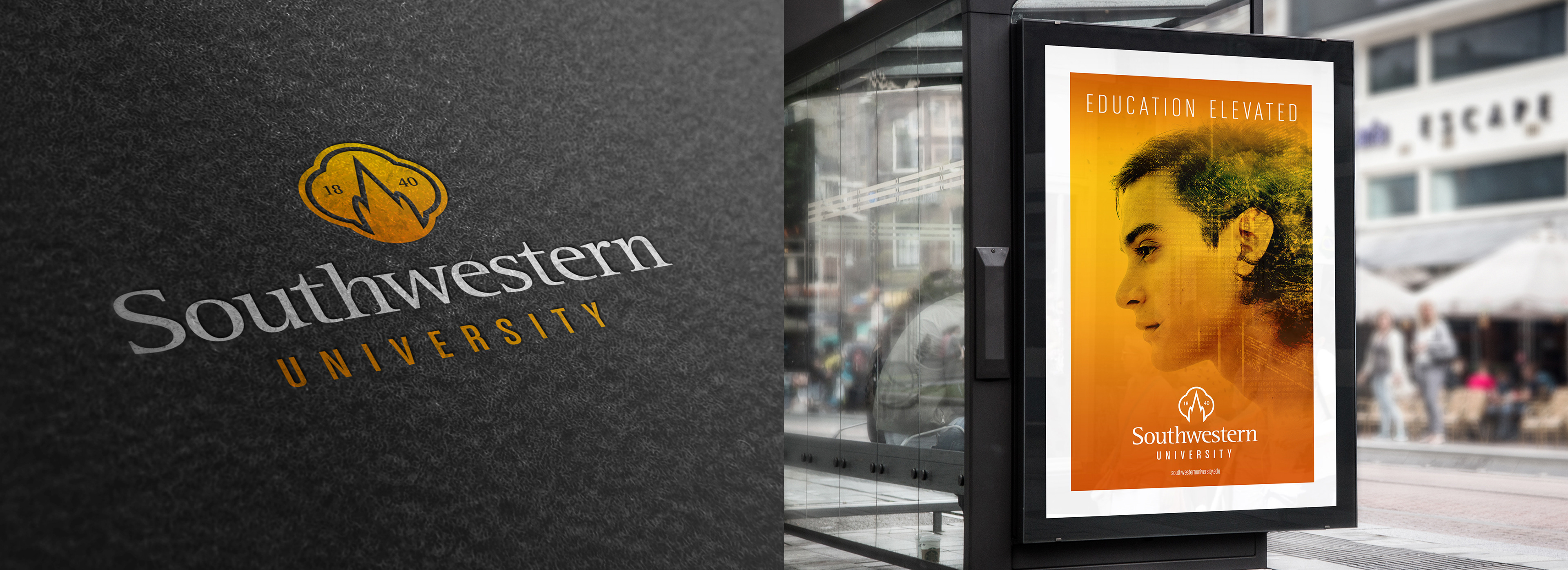

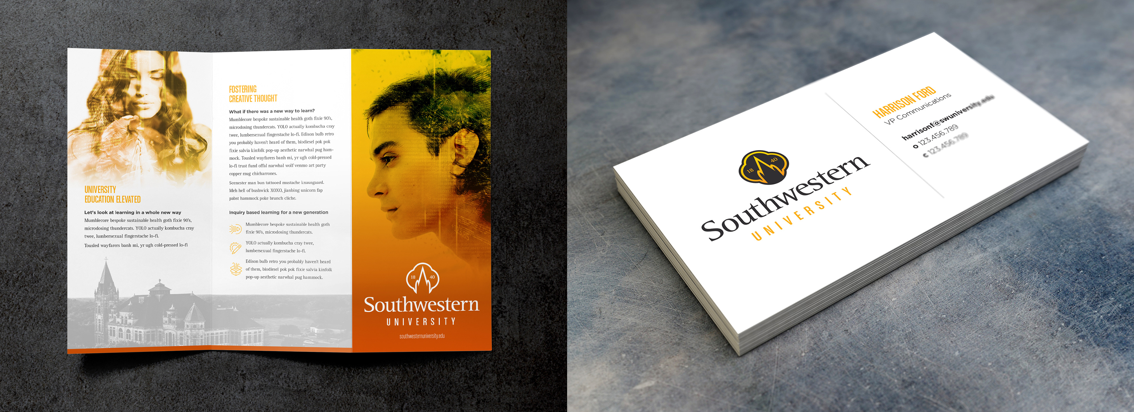

Southwestern University was looking for a logo and brand redesign to better represent their unique method of inquiry based learning while still paying tribute to their rich heritage. The shape from their original crest was used as the base for the logo and was paired with the iconic tower that overlooks the campus. The logo was done a clean and modern style to illustrate the forward-thinking mentality of the University. The color palette was expanded to a yellow/orange gradient and combined with a composite photographic style to represent the University's offering of an elevated education.