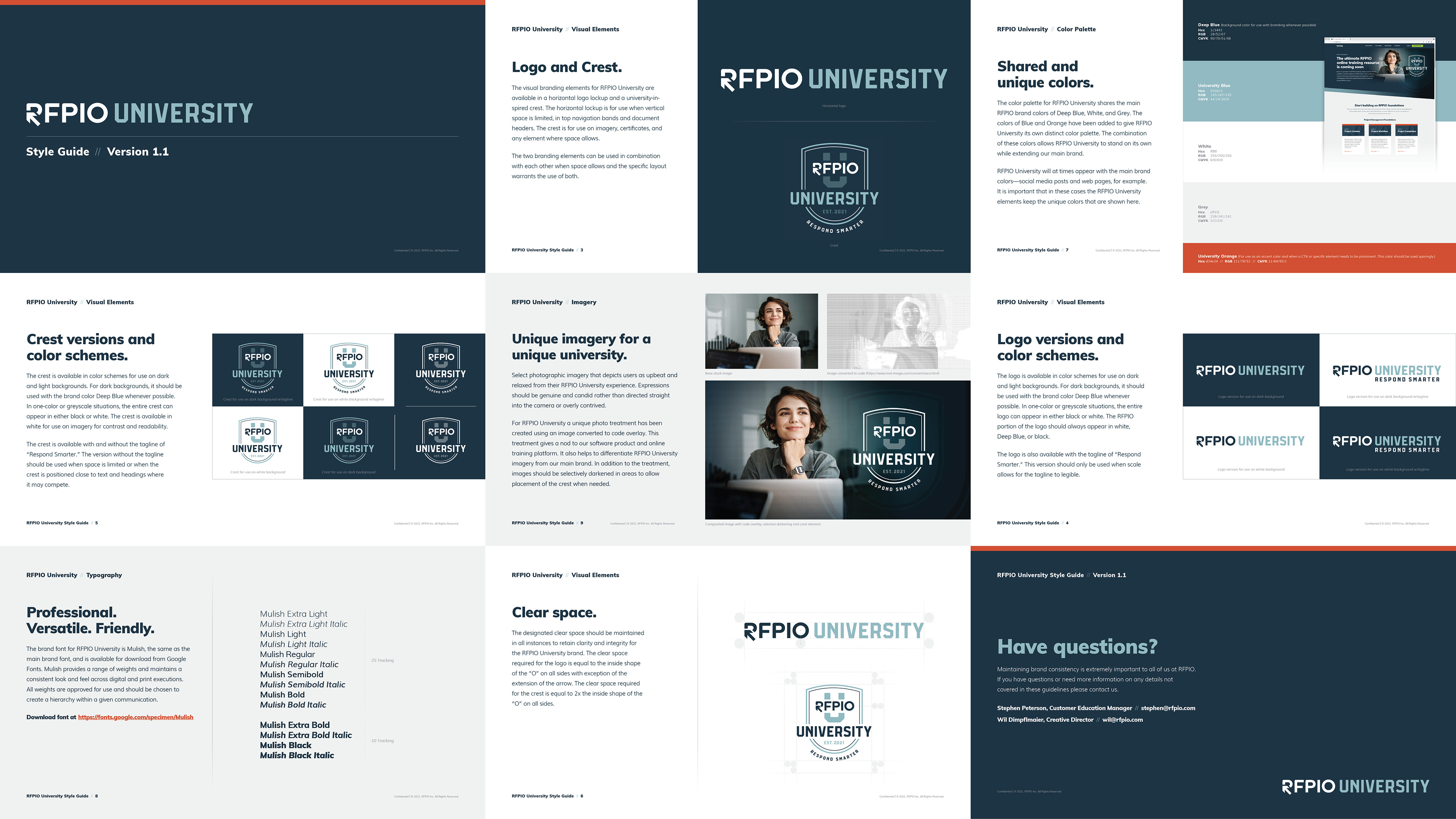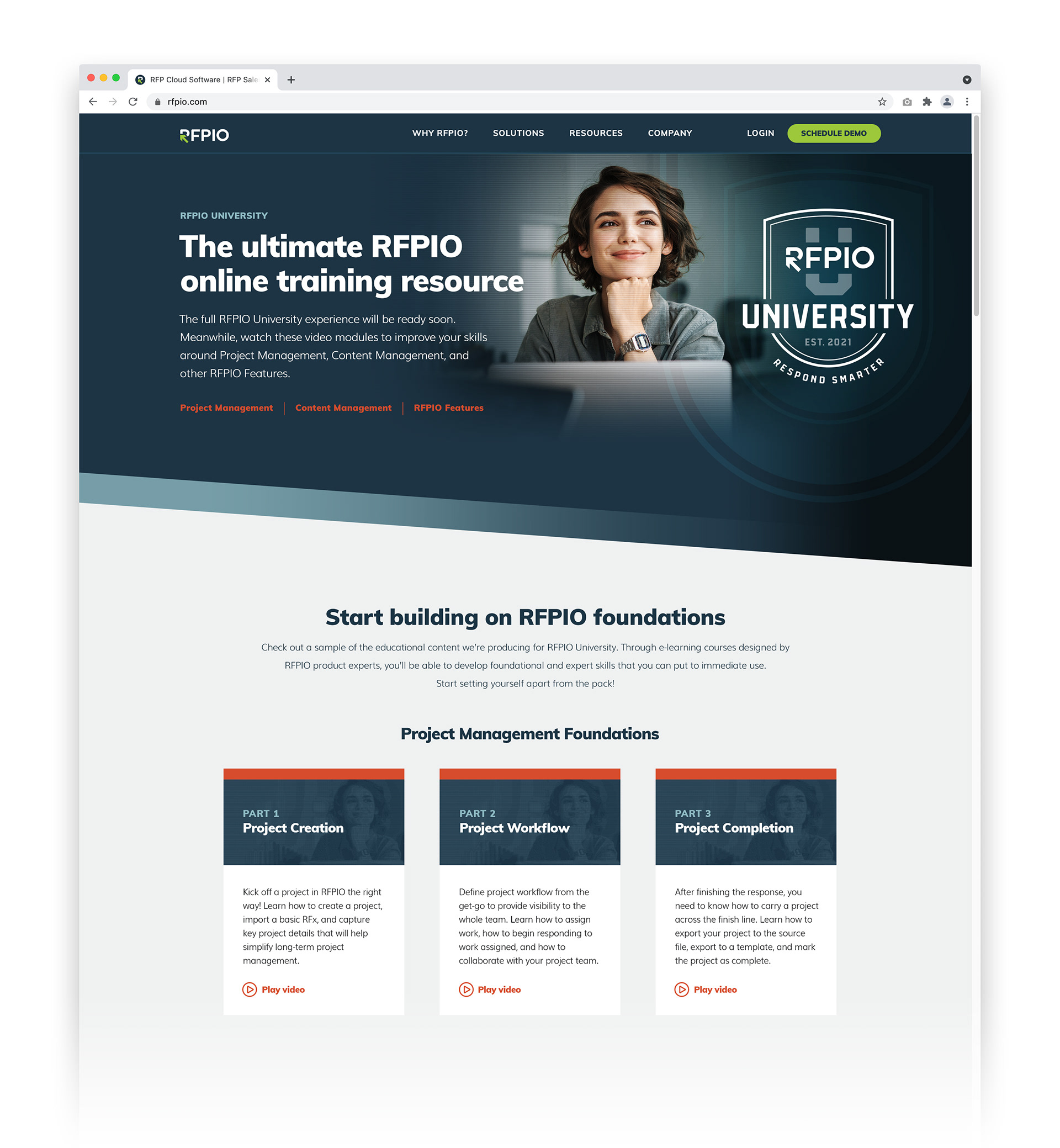
Unique branding for a unique university
RFPIO University was a branding project that took place shortly after RFPIO’s organizational rebrand. The goal was to create an identity that complimented our main brand while emphasizing that RFPIO University is robust enough to stand on its own.
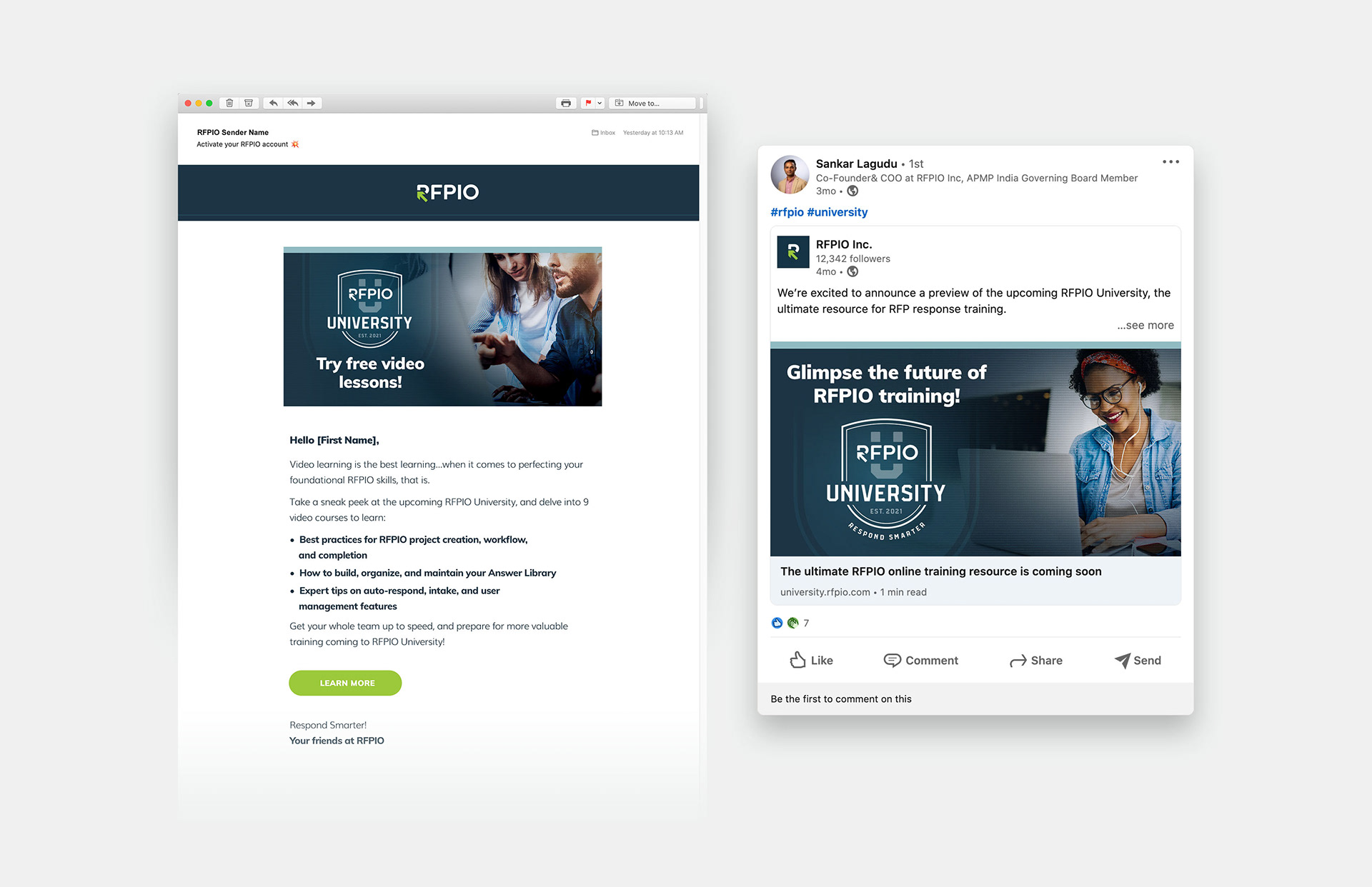
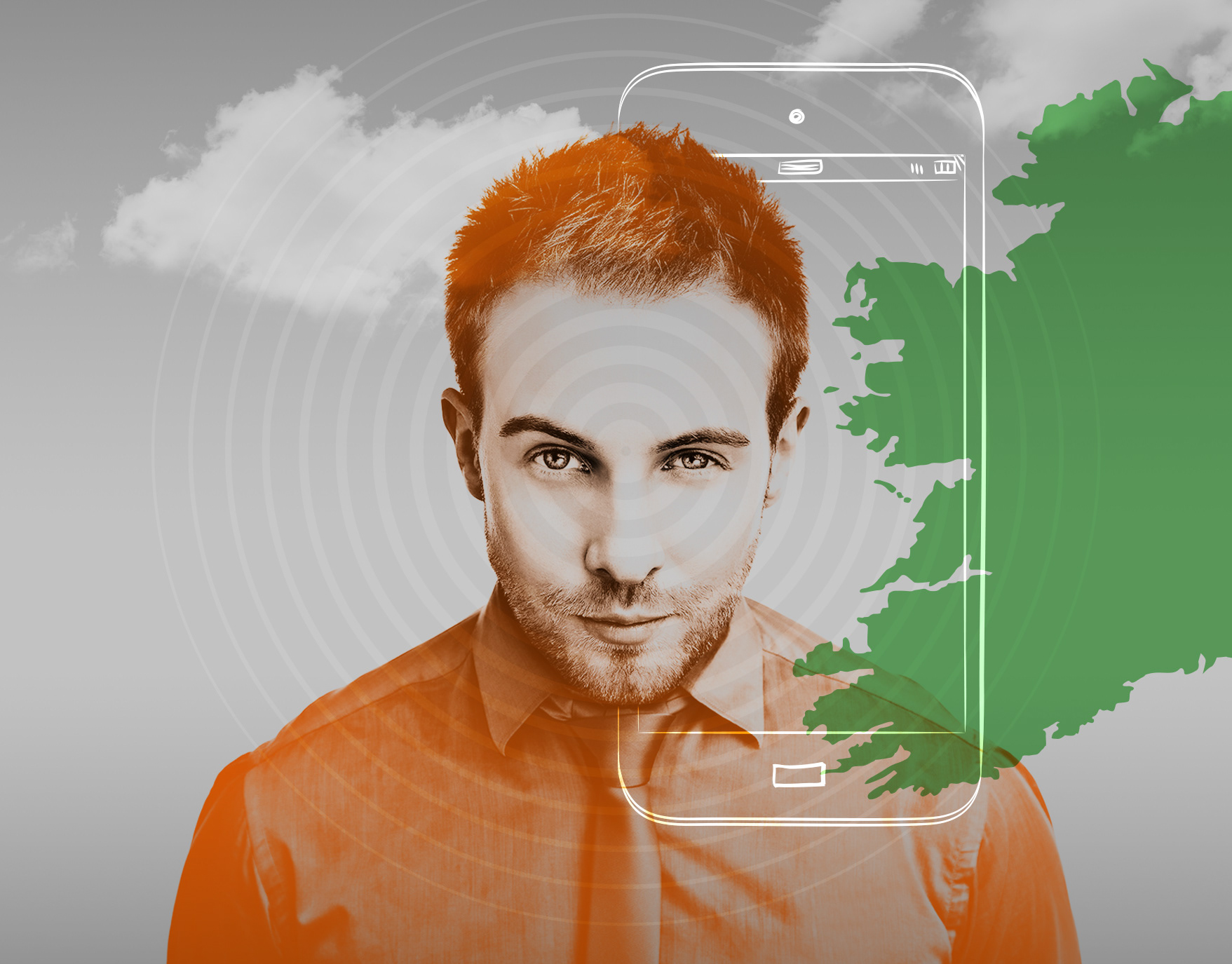
We used a similar style of photography to showcase upbeat and confident learners. We then composited each photo with a code overlay of the image to lend the learning environment a digital flare. We paired our main logo with a “university” word mark and also created a collegiate-style crest to add credibility. For the color palette, we kept our main brand deep blue for cohesion and then added the unique colors of orange and light blue to give RFPIO University its own identity.
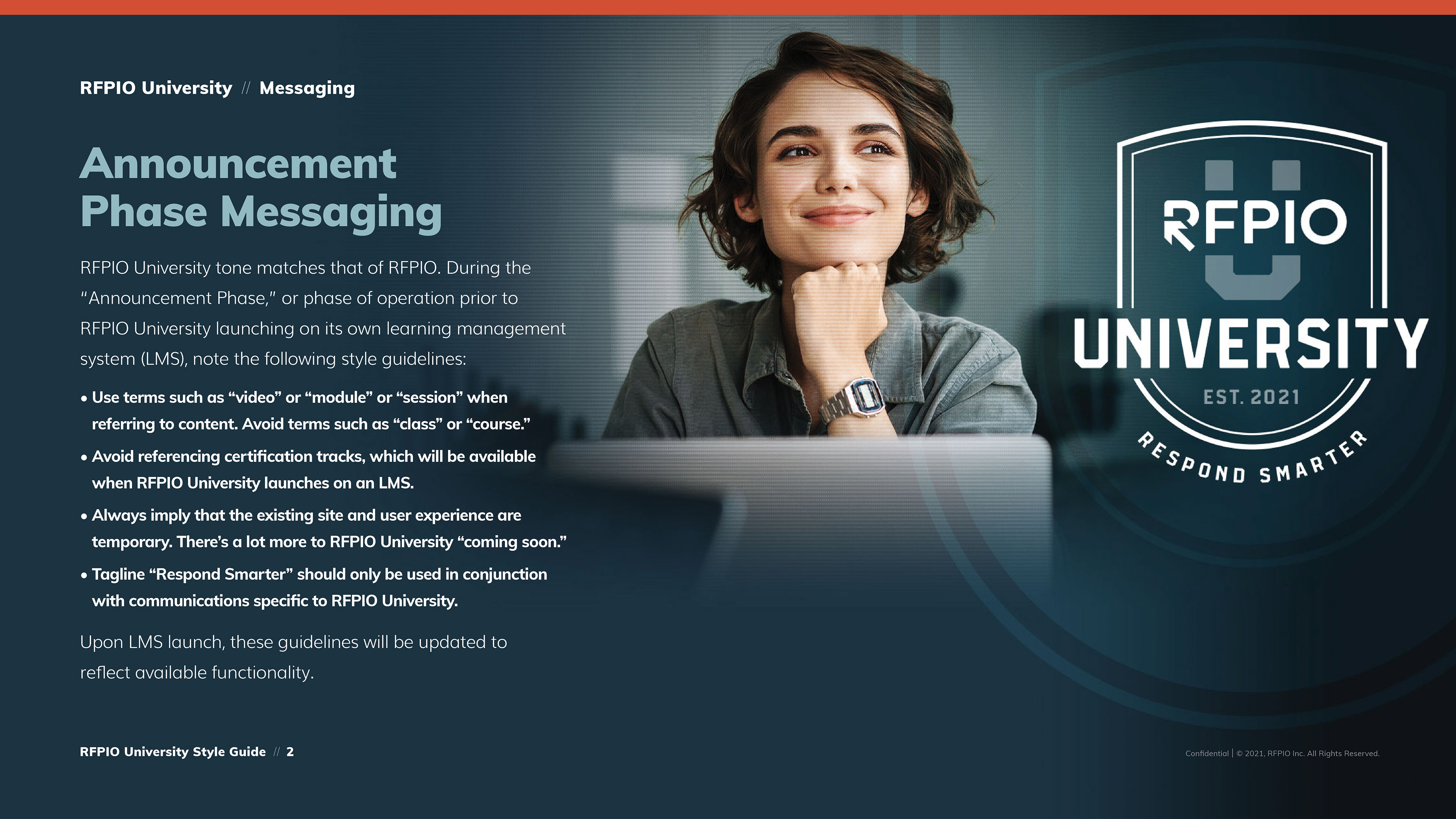
RFPIO University initially rolled out with nine videos—all with branded animated graphics—hosted on a dedicated announcement web page. Social media and email campaigns announced the launch of RFPIO University and drove traffic to the page. The full learning management system (LMS) for RFPIO University will expand the brand even further and is currently in development.